Monday

Question 1: In what ways does your media product use, develop or challenge forms and conventions of real media products?

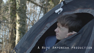
In our opening we decided to begin with a point of view shot in, that focused on a tent. There is only diegetic sound played during this shot, which mostly consists of the wildlife in the forest. 
This creates a neutral tone and sets the premise of the opening being a typical camping scene. We made use of this convention, which can ambiguously be seen to follow the horror genre. The horror film openings we reviewed in class, most notably Dead Wood are shown to have a similar opening scene. It begins with an establishing shot of the location with diegetic ambient sound only. We implemented this effect, as it would cause some
misperception in the tone of film that is being produced. This convention is developed when we decided to use this common style of opening to create a fear for the audience. Furthermore the audience developed the fear of uncertainty via the casual mood set. 


Another way in which our media product uses a convention of real media is shown by the way we constructed our characters. In our opening we cast a teenage couple that had been camping. During the opening we were sure to display the male assertiveness often portrayed in horror films. In this case the male character proactively and independently goes out to collect the fire wood, and the female girlfriend willingly complies. This takes root from one of the three horror film openings we reviewed in class, called 'Dead Mary'. It is a well-known convention that we tried to take further and reflect, through the height of camera angles when addressing the victims. We were sure keep the early shots of the male character at eye level, in order to reinstate he is in no danger at certain points of the opening. Later on when the male character is attacked, we were sure to keep in tandem with real media products and reduce his viewing space drastically, thereby removing his power drastically.

The opening titles of Se7en are an example of a horror film with titles that quite obviously abide to the horror conventions. It uses its awkward and peculiar font to alienate the audience, and make sure that it provides no familiarity or becomes relatable in any way. We decided to go against this form of media presentation by making our titles a lot more functional, however while it is seemed rather ordinary we tweaked it slightly and made the font noticeably thinner. This gave it an off look, that pandered well to the audiences of this film. It is almost alluding to the tone with the opening of our film, that played on the audiences security on what would happen in the film.

Saturday

Construction: Titles

Construction: Titles


The first font we trialled was Abadi MT. This font was bold and blocky in style, which was useful for the more obscure backgrounds used in the production for our film. The style of font stood out, however it didn't suit the vibe we were carrying across in our film and came across as too ordinary.


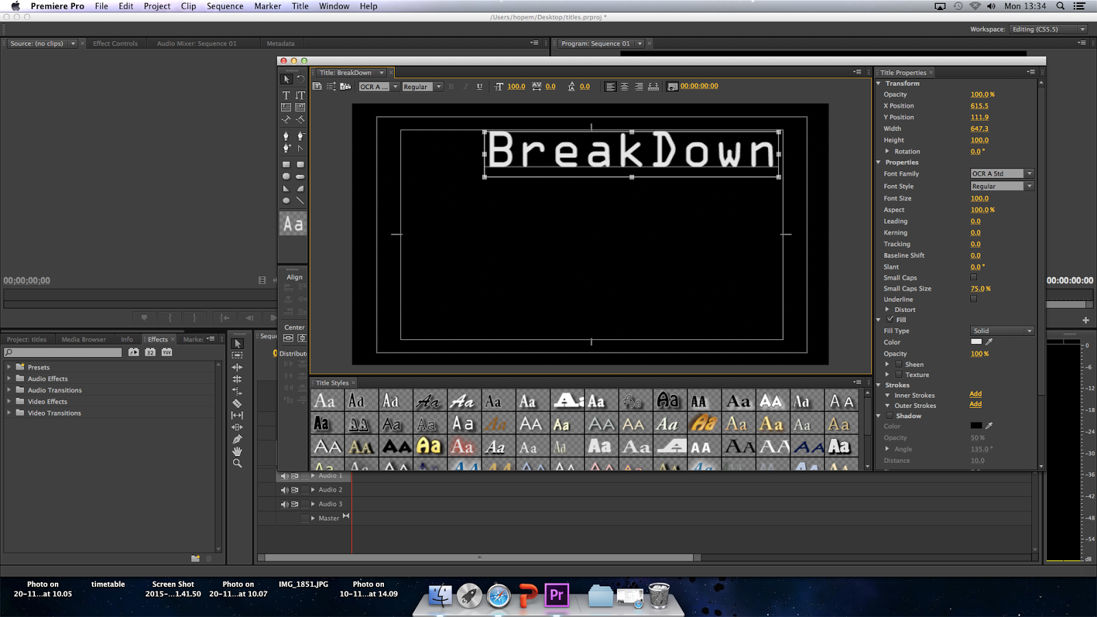
The font applied here is called is called OCR STD. The font used here is sleeker in comparison to the first Abadi MT font, but still relatively visible similarly to the first. The style came across as a step in the right direction in terms of its obscurity, and its ability to create a more peculiar atmosphere for the audience. The downside is that the font is most commonly identified with sci-fi and such genres alike.                


The font used here is called.It is larger in size than the other two fonts and is more intricate in detail, making it more difficult to read. Positively the style has the eerie look about it, more so than the previous fonts. Overall the font is too complex and impractical, as there would be problems with visibility.                                               


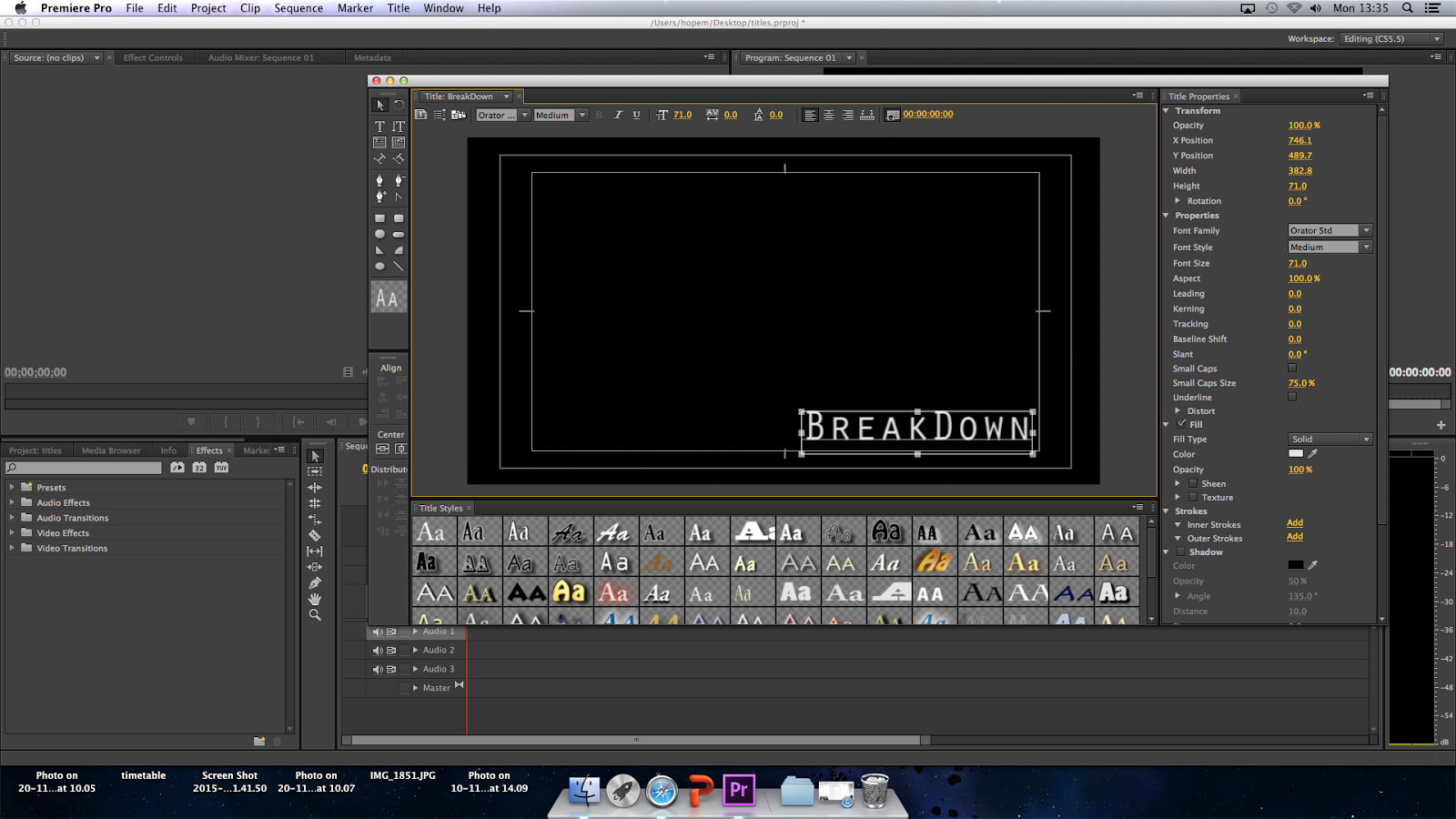
The font we finally agreed on is the Orator STD. The font was visible and incorporated the things we liked about the other three. It had simplicity and was also slightly out of the norm with the thin design.                                                    


We were cautious to place the titles in suitable positions in the run of the opening sequence. Mathew made sure they lasted for a suitable period of times. They usually lasted no more than 5 seconds, with fade in fade out transitions.                          


Friday

Construction: Editing

In class we learnt about the importance of editing, and how it has been used the affect cinema and media alike. Editing utilises the different camera shots and angles, and offers us a variety of different perspectives that we wouldn't be able to experience usually in everyday life From our lesson, we were able to appreciate how well it is applied in film. In order to do good job with this aspect of our opening, we realised we needed to make sure the editing was woven in seamlessly and looked invisible to the audience. 

To get ourselves started, we needed to sift through the clips and footage collected from filming. We did this to be able to collect the best quality clips, as well as finding the best matching scenes so that our opening flowed.


We began the editing with the aim of cutting down our footage to a maximum of two minutes. Using an editing software called Premier Pro, Matthew arranged the sequences to make an ordered set of shots for our opening in our film. This was an important process, because the way we edited could affect the whole tone of the opening.
Once we assembled the scenes in the correct order, we reviewed the length we wanted for each one. This was done in order to reflect the atmosphere in the scene and the general mood. The earlier scenes in our opening were generally the longer ones, due to the little action that occurred. As a result we were able to use the scenes to showcase various camera angles and shots.   


All the diegetic sound we used was imported straight from our footage. The only non-diegetic sound that was implemented, was the our own self made foley sound. We were influenced to use this technique after having learnt the way foley artists add realism to film sequences.


Matthew is shown here arranging the transitions of our clips, and making sure that scenes are linked together and concise. He decided to do some of this transitioning at home on his computer, as it offered him more suitable choices on which styles followed the horror conventions best. 

Wednesday

Construction: Sound

Construction: Sound

When we were looking at how sound was used in psycho, we saw that many sound effects were used to make the film more realistic. In the shower scene we learnt that a cabbage was sliced I order to provide the sound needed for the knife entering the victims body.


We then decided to use a melon splattering as some foley, to make the first death scenes in our opening more tangible. We simply used a brick to mash up the melons insides in this clip. This provided a squelching sound we needed to portray the gore, however it felt subdued.


In the clip here we decided to film Matthew stabbing the melon, to give it us some sound variance. We found that this gave out a swift sharp sound, in comparison to using a brick which wasn't as succinct.


This was the best sounding foley for our production because it sounded the most raw, due to the power of the hammer we trialled. For that reason it was able to produce the unadulterated effect. 


For our instrumental non-diegetic sound, we used a composition from a website called 'Free Sound'. Its a site that allows people to share browse, download sounds effects from other users. In the beginning of our opening we decided to leave out any non-diegetic sound, leaving in only natural diegetic sound of the wildlife in our location. However when the first victim is isolated, we chose to layer a sound clip with three beats that was meant to mirror a heart beat. This sound is noticeable, though not to the extent of being overpowering. The climax presents itself when the victim is being attacked, and there are some wind instruments included that match the speed of the action. This composition continues the remainder of the opening.